Three years ago, Edge collaborated with The Serpentine Gallery in London in a program of "table-top experiments" as part of the Serpentine's Experiment Marathon. This live event was featured along with the Edge/Serpentine collaboration: "What Is Your Formula? Your Equation? Your Algorithm? Formulae For the 21st Century.
Hans Ulrich Obrist, curator of the Serpentine, invited Edge to collaborate in his latest project, The Serpentine Map Marathon, produced in conjunction with DLD (Digital - Life - Design) Saturday and Sunday, 16 - 17 October, at Royal Geographical Society, 1 Kensington Gore, London SW7 2AR (Map). The multi-dimensional Map Marathon features non-stop live presentations by over 50 artists, poets, writers, philosophers, scholars, musicians, architects, designers and scientists. The two-day event takes place in London during Frieze Art Fair week.
In addition to presenting maps by Edge contributors, the Marathon featured a panel of Edge contributors Lewis Wolpert, Armand Leroi, with myself as moderator, at the Royal Geographical Society.
- JB

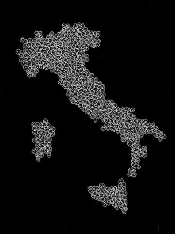
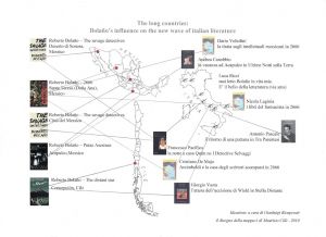
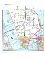
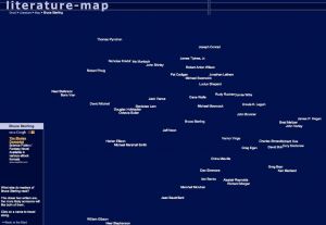
This is a map, work in progress. It is the first of a series of maps which traces the influence of some major contemporary writers (sebald, bolano, wallace and others) on different literary scenes in the world. In this map the 'long countries' (by shape), Chile, Italy and Mexico, which are crucial settings in all of Bolano's texts are connected with names of 'la nuova onda', our great new literary scene in Italy. I asked some writers to tell their favourite Bolano sequence and put their hometown in connection with the physical space in whic the sequence take place. A number of coincidences and overlappings between imagery, texts, landscape take place in this map.

Mapping social behaviour. Social insects should be faithful to their nests because they gain genetic fitness benefits from raising kin. Yet, monitoring the movements of individually radio-tagged wasps reveals that 50% of paper wasp workers 'drift' between different nests: workers appear to help raise related brood on the nests they visit. These social networks, mapped from the movements of 455 radiotagging wasps from 32 nests (represented as nodes in the map), show the relative drifting rates (represented as the 'edges' or lines in the map) of tagged workers between nests within 4 nest aggregations. Without radio-tagging technology, these maps could not have been generated, and hence a potentially important aspect of social behaviour would have gone unnoticed.

Tom Frankland: Illustrator

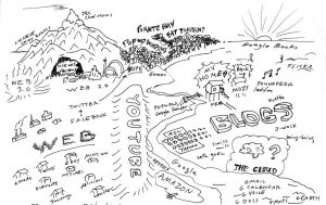
A mapping analogy for explaining to people the mingling and evolution of influences in the World Wide Web technology.

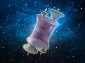
A somewhat fanciful depiction of a multiverse consisting of a background empty spacetime giving birth to baby universes, as proposed in my 2004 paper with Jennifer Chen. Artwork by Jason Torchinsky.

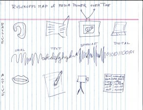
Rushkoff's Mao of Media Power over Time


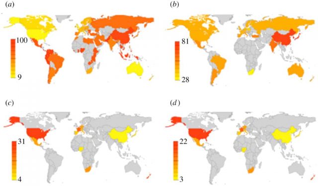
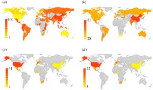
A map examining the world-wide geographic coincidence between culture, genes and mood disorders from my paper with Kate Blizinsky published in 2010...Geographical coincidence between serotonin transporter gene diversity and cultural traits of individualism–collectivism across countries. Colour maps include all available published data for each variable of interest. Grey areas indicate geographical regions where no published data are available. (a) Colour map of frequency distribution of IND-COL from Hofstede (2001). (b) Colour map of frequency distribution of S alleles of 5-HTTLPR. (c) Colour map of frequency of global prevalence of anxiety. (d) Colour map of frequency of global prevalence of mood disorders. Yellow to red colour bar indicates low to high prevalence.

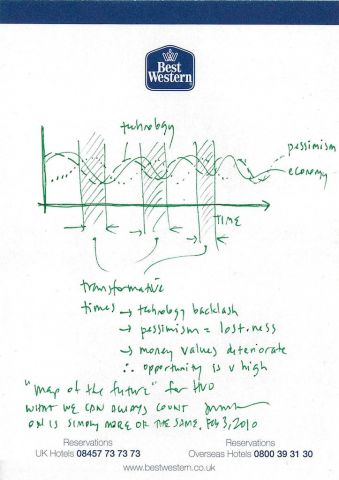
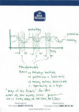
"Map of The Future" for HUO. What we can always count on is simply more of the same.

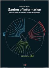
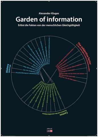
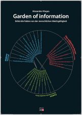
Garden of Information

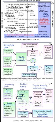
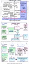
Mapping the undiscovered continents of the mind. In 1970 I developed an early version of map (A) in an attempt to communicate what I thought was being overlooked in the study of the human mind, and what a new evolutionary and computational approach might have to offer. One can crudely map proposed components of the human architecture according to how computationally simple or complex they are on one axis, and how functionally specialized or general-purpose they are on the other axis. The region at the lower edge (simple) corresponded to behaviorist and associationist models of human nature. The cognitive revolution introduced proposals for components that were more computationally complex, but these were widely assumed to be general-purpose. The region at the right edge (general-purpose) corresponded to the near-universally accepted blank slate models of human nature. These two areas (marked in blue) almost exhausted the scientific imagination of behavioral scientists at the time, and indeed until recently. Few were looking beyond these borders at the large unexplored white region. Yet, natural selection would have inevitably populated this area with functionally specialized components designed to solve important, recurrent adaptive problems: from coalitions to mating to bargaining to friendship to incest aversion. To solve these problems efficiently, the circuit architecture of these components would often need to be complexly specialized for the task. These programs or instincts are numerous, have built in content, generate the major outlines of the human social world, make cultures similar to each other, provide a new natural science foundation for social theories, and are eminently worth studying. Most important, their evolved information processing architectures can be mapped--something I have been working on with my wife Leda Cosmides, and our students and colleagues. For example, (B) is a map of the circuit logic of a neural system that evolved to detect genetic relatedness in familiar others, and use detected kinship to (i) increase disgust at the prospect of sexual contact; and (ii) to increase the weight placed on the relative's welfare. (C) is a map of some evolved computational elements of human alliance and coalition psychology.

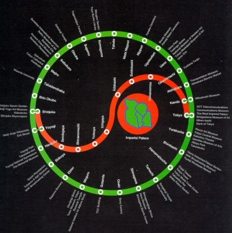
Map of Tokyo

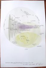
Motional Space Map (Emotional) Future City Life


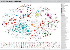
How diseases link to each other thanks to the shared genes. We call it the diseasome.? Credit: Kwang-Il Goh, Michael E. Cusick, David Valle, Barton Childs, Marc Vidal, Albert-Laszlo Barabasi


RAQS media collection

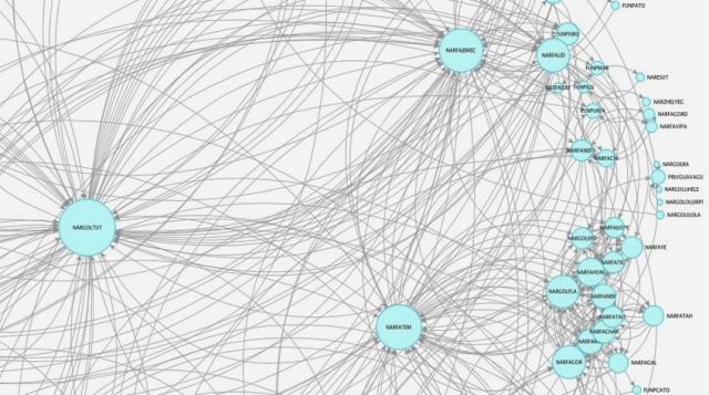
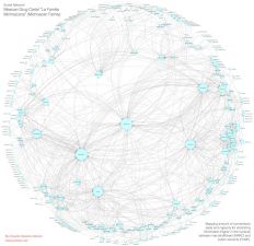
A social network mapping arbitration of information and amount of connection between narcotraffickers and public servants in a Mexican Cartel

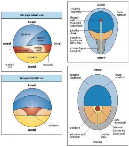
Fate map of early embryos for frog, chick, and mouse. They show what regions of the embryo will develop into.

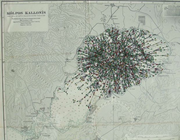
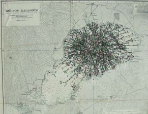
An 1817 British Admiralty map of Kolpos Kallonis, the lagoon in Greece where Aristotle began the study of the biological world. Aristotle proposed that organisms were formed and maintained by their “souls,” by which he meant the topography of their metabolic and regulatory networks. Superimposed within the lagoon, therefore, is a map of the regulatory network of a yeast cell: Aristotle’s vision realized in the 21st C.

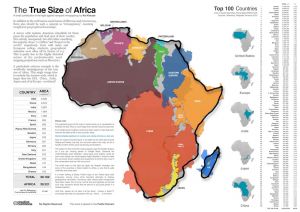
A map about the complete inability of the general public to gauge the relative sizes and distances, the areas, the population....Often there are extremely basic assumptions with distortions that would be hilarious, if they weren't at the same time so deeply sad as well...Analogous to illiteracy and innumeracy I coined the term "immappancy".

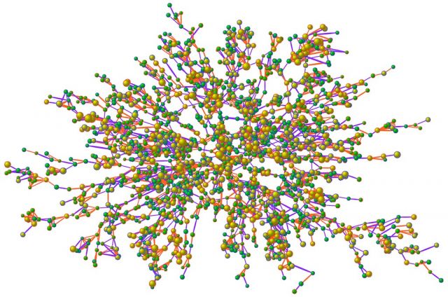
A Map of obesity within the kind of social network we all inhabit. There are 2,200 people (nodes) and many thousands of ties (lines) between them. Nodes with blue borders are men and red borders are women. Bigger nodes are bigger people, and the interior color of the nodes indicates whether the person is obese: yellow are obese and green are non-obese people. The colors of the ties between the nodes indicate the kind of relationship (e.g., friend, spouse, sibling). Clusters of obese and non-obese individuals are visible, and these arise not only because individuals of similar body size preferentially form ties, but also because one person's body size affects that of another to whom they are connected. This map sent us on a new direction in our research, orienting us to new possibilities that network science had for understanding the human condition, and improving it.

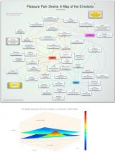
?(top) Spinoza’s most fundamental affects are pain, pleasure and desire. They lie beneath all the other affects and can be thought of as closer to organic conditions than psychic ones. The more complex emotions bear an indirect link to the three just named.??(bottom) The Market's Expectation of Future Uncertainty in a Stochastic Volatility Model

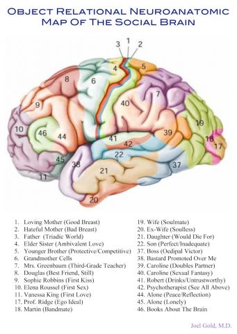
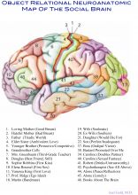
Object Relational Neuroanatomic Map of the Social Brain

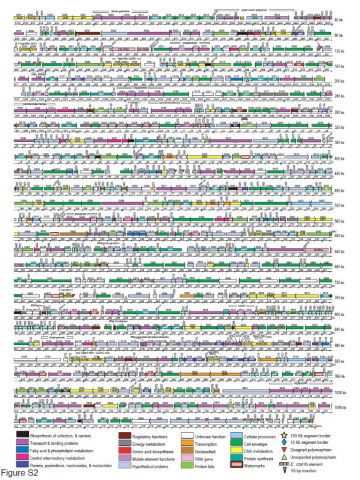
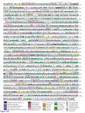
The map of the genome of the first synthetic cellnning of all we see now.
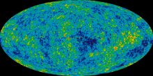
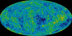
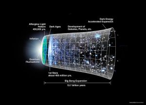
A temperature map of the Universe 400,000 years after the Big Bang.This was the end of thermal equilibrium and the beginning of all we see now.
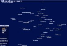

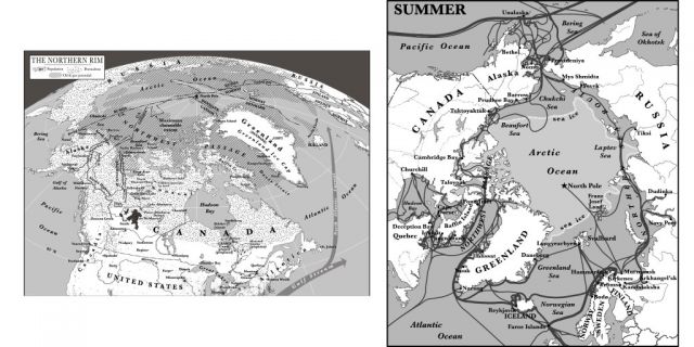
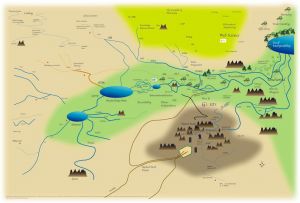
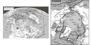
?These maps illustrate my vision of "The New North" - eight countries and surrounding seas in the planet's northern quarter of latitude - that will enter a period of rising biological productivity and global strategic value in the 21st century. The New North will emerge as a new geographic and economic region alongside the more familiar Global North ("Core") and Global South ("Periphery") in the next few decades. The first map shows "The Northern Rim" as viewed from North America, and includes population density, human infrastructure, anticipated resource deposits, and a quiltwork of overlapping political claims to the Arctic Ocean seafloor. The second map illustrates the onslaught of shipping that invades the Arctic each summer, as the seasonal sea ice retreats. In the 21st century, with sea ice expected to disappear completely in summer, such human activity will only intensify.

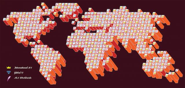
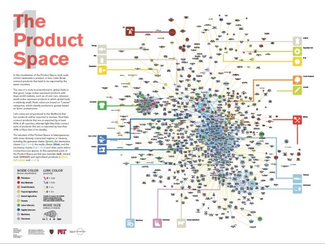
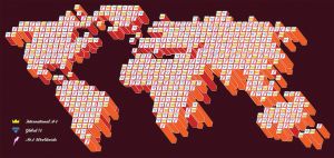
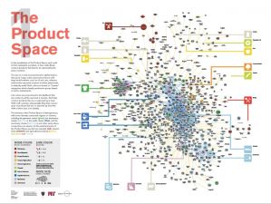
A map of the world economy, and a road map to industrial development. This poster is based on research Laszlo Barabasi and I published in SCIENCE in 2007 and were done in collaboration between my group at MIT and the Center for International Development, at Harvard.
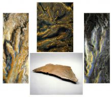
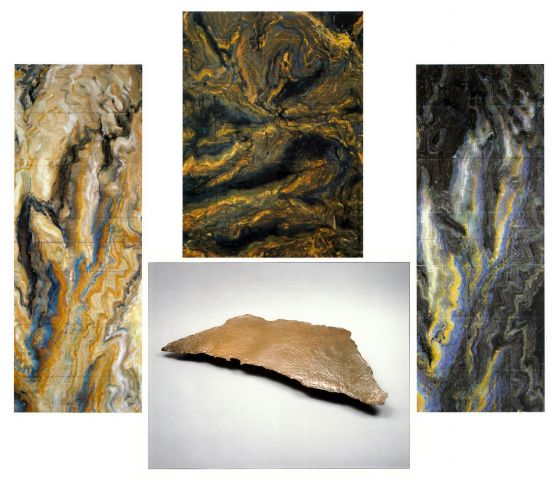
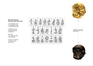
Examples of my map paintings - these are of the Grand Canyon, the bronze is from my "Lakes' series ?Clockwise from left: Bright Angel 2001 132" x 48" ink & oil paint on canva; Obi Canyon - 2001 66"x 48" ink and oil paint on canvas; Bright Night 2001 132" x 48" ink & oil paint on canvas; Edison Lake - 1976 cast bronze

Chart of the Alaska Peninsula and North Pacific Ocean, ca. 1770, by Russian navigator Vasilii Fedorovich Lovtsov. Note that the correct positions of Kodiak Island and the Shumagin Islands have been transposed. During this exploratory period a condition for being licensed to harvest furs in Russian America was to submit charts of the new territory to the Russian crown. I believe the islands were deliberately misplaced to lead competitors astray. What deceptions similar to this 18th-century misrepresentation await us among the data being mapped in the 21st? (courtesy Provincial Archives of British Columbia)

An expected value map that my laboratory generated in 2005, in 2 and 3 dimensions. The map illustrates brain regions whose activity (or oxygen utilization) increases proportional to the amount of money people anticipate making (and combines data from fourteen subjects). From a neuroscience standpoint, it is interesting to note that these regions overlap the ascending projection areas of midbrain dopamine neurons. Researchers are now using activity in some of these regions to predict subjects' upcoming choices (e.g., in investment or shopping scenarios).

Mapping successive layers of historical narratives on to contemporary physical structures and performances

Raycounting: curvature guided by light

This is a map of the space-time for our observable universe. It shows two of three spatial dimensions and the time. It shows the beginning of time to the present epoch. You have to imagine the third spatial dimension as the continuation of the sphere of space around us for which the two dimensions show a circular cross section.

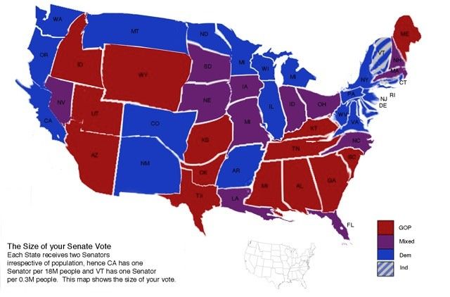
The USA constitution delegates two Senators to each state irrespective of population, allowing less populated states to exert an undue influence in American politics, the following depicts by physical size the voting influence of the America states, eg the less populous the larger the depiction, the more populous the smaller the depiction, the size of one's vote.

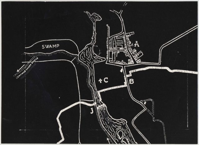
Swamp: This is a found photograph. Its probably from a movie. It shows where the swamp is. I would guess Swamp Thing, but who knows.

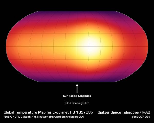
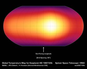
The first surface map of a planet outside our Solar System. The planet is a gas giant orbiting a star 60 light years away. What you see is a very crude image of its extremely heated atmosphere. The map is not from a direct picture, instead it was reconstructed from a subtle variation in the light over a planet's orbit.

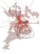
Map of the human Heart - created for the novelist Ialin Sinclair for his novel London Orbital

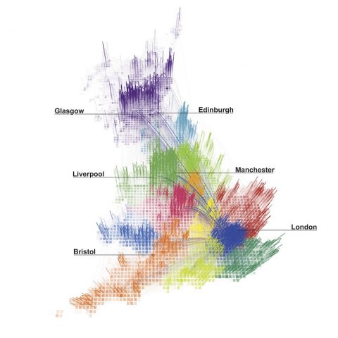
Redrawing the map of Great Britain from a network of human interactions Do regional boundaries defined by governments respect the more natural ways that people interact across space? This paper proposes a novel, fine-grained approach to regional delineation, based on analyzing networks of billions of individual human transactions. Given a geographical area and some measure of the strength of links between its inhabitants, we show how to partition the area into smaller, non-overlapping regions while minimizing the disruption to each person’s links. We tested our method on the largest non-Internet human network, inferred from a large telecommunications database in Great Britain. Our partitioning algorithm yields geographically cohesive regions that correspond remarkably well with administrative regions, while unveiling unexpected spatial structures that had previously only been hypothesized in the literature. We also quantify the effects of partitioning, showing for instance that the effects of a possible secession of Wales from Great Britain would be twice as disruptive for the human network than that of Scotland. ??Image Credit Mauro Martino. Credits Carlo Ratti, Stanislav Sobolevsky, Francesco Calabrese, Clio Andris, Jonathan Reades, Mauro Martino, Steven H Strogatz

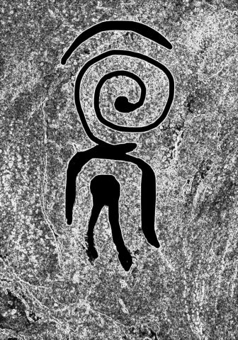
This image was painted on the wall of a cave in Vilafames, Spain, about 15000 years ago. When I came across it in 2006 I was taken aback to see its resemblance to a drawing I had made a few years earlier to illustrate the interiority -- and privacy -- of consciousness. Was the Neolithic artist giving us a map of what it's like to be human?

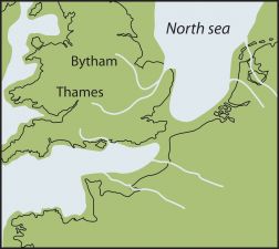
During the earliest periods of human occupation, the geography of Britain differed considerably from that of today. Britain was not an island but a peninsula of the north-west European continent. 900,000 years ago there was no English Channel, but a precursor of the river Thames flowed, far to the north of its present valley, reaching the North Sea at Happisburgh. This land bridge was the point of entry into Britain for migrating animals, including humans. Source: Ancient Human Occupation of Britain project http://www.ahobproject.org/

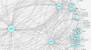
A partial map of BoingBoing content

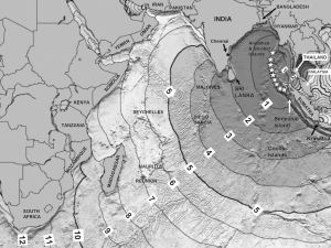
The first twelve hours of the 2004 Indian Ocean tsunami caused by a 900-mile long submarine earthquake (indicated by the stars). But it was the first two hours that were most devastating.Only 17 minutes after the earthquake, a 100-foot tsunami bulldozed towns out of existence along the Aceh coast of northern Sumatra, Indonesia. In less than an hour 240,000 were dead. In less than two hours smaller but still powerful tsunami waves had killed 7,500 in Thailand, 31,000 in Sir Lanka, and 16,000 in India. Submarine ridges focused the tsunami wave energy like a lens focuses light, eventually guiding them out of the Indian Ocean and up the Atlantic, though now greatly reduced in size. It was that same bathymetric effect that sometimes determined who would live and who would die. More than 8,500 Sri Lankans died in Kalmunai at the shoreward end of a submarine ridge, while eight miles south only 2 died in Oluvil at the shoreward end of a submarine canyon. This is a modified version of a model-produced map from NOAA’s National Geophysical Data Center.
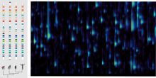
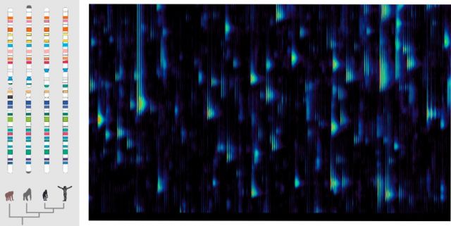
(left) Chromosome 9. A schematic map of a chromosome shared by all the great ape, showing our degree of relatedness.?(right) A map of a human proteome. The molecules from a drop of human blood are mapped by weight (left to right), and by slipperiness (top to bottom). The reason that multiple stripes appear in series is that the atoms in proteins come in different isotopes creating variations that different in weight by a single neutron.

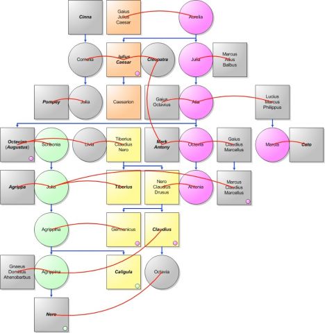
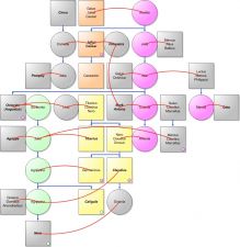
DNA of the Early Roman Emperors and Famous Associates: Squares are males. Disks are females. Blue arrows show direction of descent. Horizontal blue bars bind siblings. Red curves join "spouses" – that is, procreative couples. In cases of multiple spouses, the child goes with the most tightly bound spouse. Yellow squares represent one strain of Y-chromosome DNA (YDNA) passed down via males only; orange another. Magenta disks represent one strain of mitochondrial DNA (mtDNA) passed down via females only; green another. Small disks within squares are males carrying the designated mtDNA, who could not, being male, pass it on. The surprise is the predominance of the mtDNA lines over the YDNA – that is, of the feminine connections over the masculine.

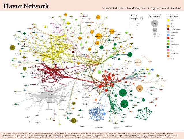
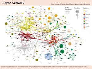
??Flavor network: culinary ingredients and their chemical relationship. The color of each ingredient represents the food category that the ingredient belongs, and the size of an ingredient is proportional to the frequency we use. Two culinary ingredients are connected if they share many flavor compounds. The thickness of an edge represents the number of shared flavor compounds.

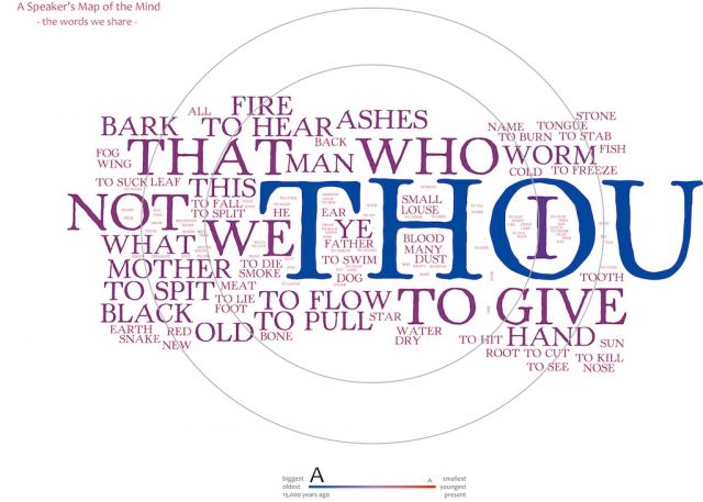
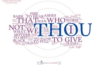
??The oldest words in our lexicon (largest font in image) change through history slowly enough that they might have been recognized by people living 15,000 years ago or more, younger words (small font) would not. Our ancient shared speech is dominated in all languages by social relations: you, me (I), what we do, to whom, and has been throughout our history. Map credit: Mark Pagel and Andreea Claude
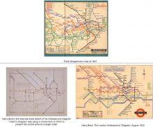
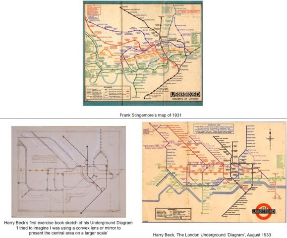
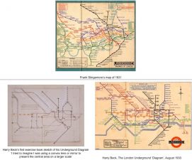
The first Harry Beck London Underground map?While I have no special map of my own, I recommend posting the first Harry Beck London Underground map. It was the world's first topological map. Beck trained in electronics as a young man, hence the circuit board appearance. I am attaching 3 ppt slides showing the London Underground railway map before Beck, Beck's first sketch of a new diagram (he always called it a 'Diagram' not a 'map'), and his first finished map of 1933. Stingemore's map made travel seem complicated and journeys looked very long (most of the stations couldn't even fit on the map!). People weren't using the Underground because of that and it was heading for financial disaster. Beck's map solved all these problems. He enlarged the crowded inner regions, brought in the outer regions, had all lines horizontal, vertical or 45 degress, and beautifully solved the problem of representing exchange stations. Besides being one of the world's iconic design classics, its sociological impact on London was huge: it defined the way most people think of the layout of London as well as the house price contours. Whereas Stingemore's maps were geographical, Beck's were not. He didn't try to represent where stations really were geographically. All that mattered were the links to other stations — and when you are under the ground all that does matter is the next station. If you draw a map on a large rubber sheet then a topologically equivalent map is created by stretching the sheet in any way you like without tearing it. The links will all be preserved but the distances between stations on the sheet will change. Beck's was the first map of this sort.

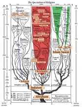
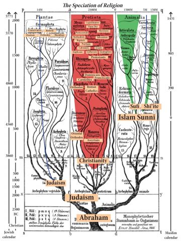
Religions, like animals, plants and bacteria, speciate. If beliefs and institutions don't adapt and adopt, as the environment changes, they too go extinct. This map illustrates some of the speciation that occurred with three of the world's great religions after originating from a common Abrahamic belief. (P.S most don't adapt which is why > 90% of the world's religions and Gods are now extinct…)
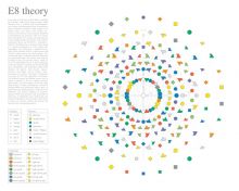

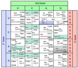
A roadmap for eliminating viruses from industrial microbes (& possibly agriculture and humans). It shows the "Genetic Code" used in every living thing on our planet -- all 64 possible triplet "codon" combinations of 4 bases: A, C, G, U. The numbers represent how many times each of these occurs in the star of genome engineering -- E.coli. The 3-letter names in black are the 20 amino acids encoded by the triplets. The 3-color uppercase symbols represent the "anti-codons" in the tRNA molecules responsible for the decoding. We are using this map to design and construct new genomes with new codes.

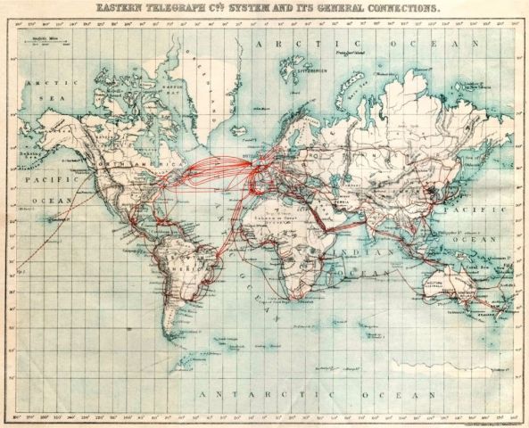
This is a map of the Internet in 1901. Surely there was no Internet in 1901? But each technology is built on top of the previous technology, and the Internet is no exception. It was built on top of the telephone network, which was built, in turn, on top of the telegraph network, which already girdled the world by the end of the Victorian era, in 1901. So here it is. The Internet in 1901.

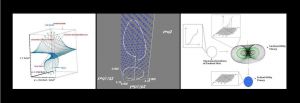
Economic Triptych: Marginal Revolution II. These panels are actually maps of maps designed to show mathematicians and physicists that economics has the same deep structure as fundamental physics and differential geometry. The first panel shows the 'indifference map' and budget constraints of a consumer painted onto a so-called fiber bundle generalizing the x-y plane. The second shows economist François Divisia's 1925 economic theory of price and quantity indices for this consumer has the structure of an electromagnetic potential capable of reproducing the 1959 Aharonov-Bohm physical effect. The last panel shows that the theory of economic welfare has the structure of an infinite dimensional principal bundle whose symmetries are well-known to string theorists as the Virosoro group. It is depicted here in 3 visual dimensions as the mathematician's Hopf Fibration.
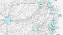

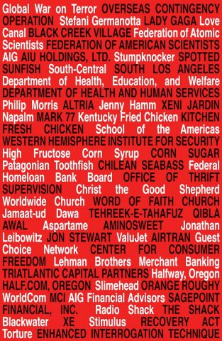
Deception REPUTATION MANAGEMENT BY NAME RECONFIGURATION. Jean Jaurès apparently once said, “Quand les hommes ne peuvent changer les choses, ils changent les mots.” By mapping old names to new ones, this piece hopes to capture the spirit of that quote as well as some of my research on shame and reputation.

