Conversation: Serpentine Gallery ~ Edge: Map Marathon
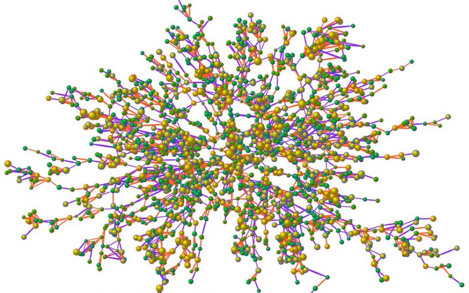
A Map of obesity within the kind of social network we all inhabit. There are 2,200 people (nodes) and many thousands of ties (lines) between them. Nodes with blue borders are men and red borders are women. Bigger nodes are bigger people, and the interior color of the nodes indicates whether the person is obese: yellow are obese and green are non-obese people. The colors of the ties between the nodes indicate the kind of relationship (e.g., friend, spouse, sibling). Clusters of obese and non-obese individuals are visible, and these arise not only because individuals of similar body size preferentially form ties, but also because one person's body size affects that of another to whom they are connected. This map sent us on a new direction in our research, orienting us to new possibilities that network science had for understanding the human condition, and improving it.

